Logo Animations: Graffiti Branding
Role - Designer, Animator
• •
Mock logo animations for a few graffiti supply companies I used growing up. Graffiti was my introduction into the art world when I was younger, so I was familiar with a few brands that would be fun to use. I chose Krink, Molotow, and Grog as my 3 companies to brand.
Grog is an Italian marker brand that specializes in paint markers that create long, heavy drips with rounded mop tips. Their aesthetic is based around bright colors, drips, dark contrasts, and liquid textures. To parallel these aspects I decided to use cel animation to create colored liquids that morph and build each letter in the grog logo. This alludes to the core of Grog’s product, while not straying too far from the form of their main logo.
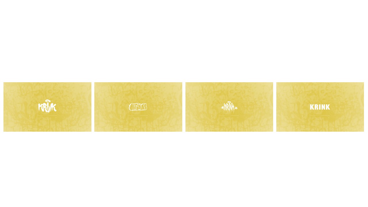
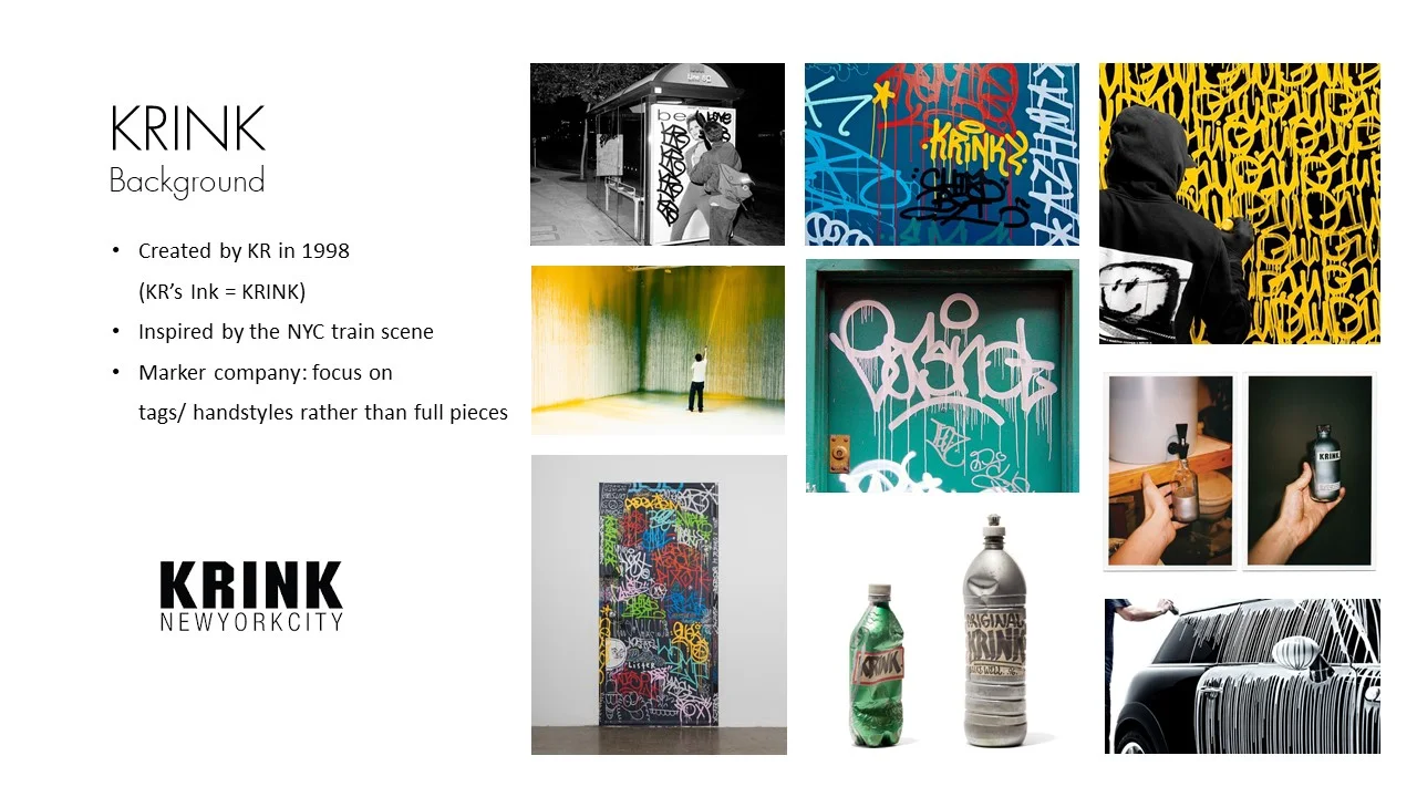
Krink is a NYC base marker brand that focuses on tags and handstyles. Their products range from chisel tipped ink markers, to rounded mop paint markers, to an actual fire extinguisher made to throw paint long distances. I decided to focus on Krink’s history in establishing different tags and handstyles based on the products they’ve released in New York City. To do this I showcased a variety of tags done in different styles, quickly cycling through until ultimately landing on Krink’s main logo.
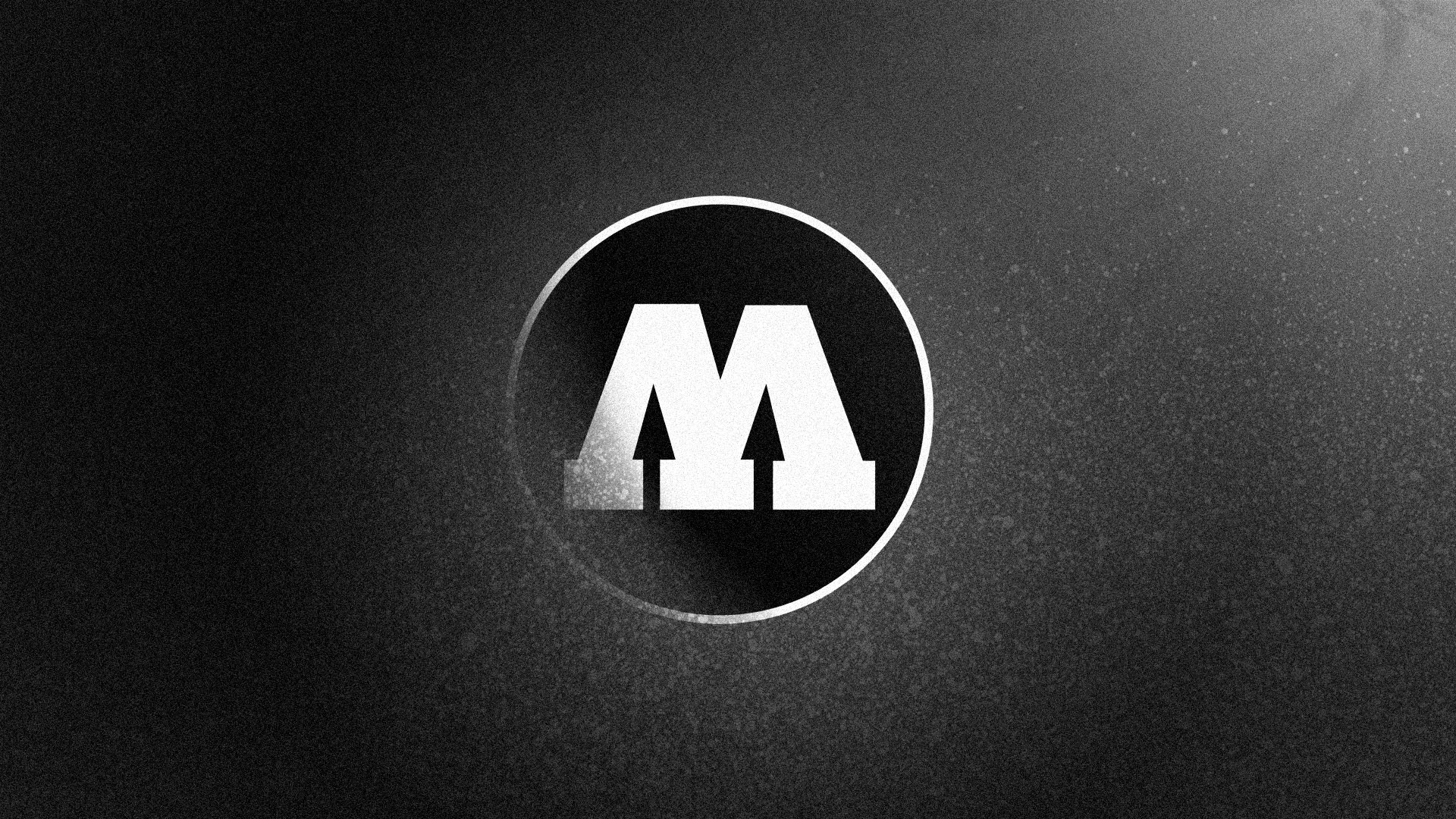
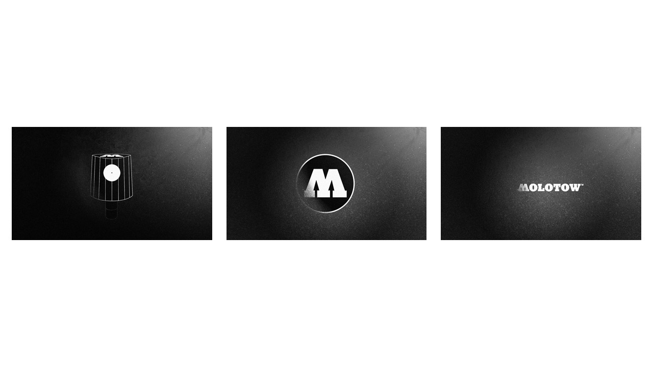
Molotow is a spray paint and marker company that has been active in Germany since 1959. Their aesthetic is really based on their paint, usually displaying their orange label or black and white logo. I drew inspiration from Molotow’s circle logo, as well as the caps they manufacture to fit their cans. I made a darker, textured logo animation focused around the feeling of spray paint, and the form of a paint cap. A single cap appears, falls into Molotow’s circle logo, and shifts left to reveal the full main logo.
• •


• •